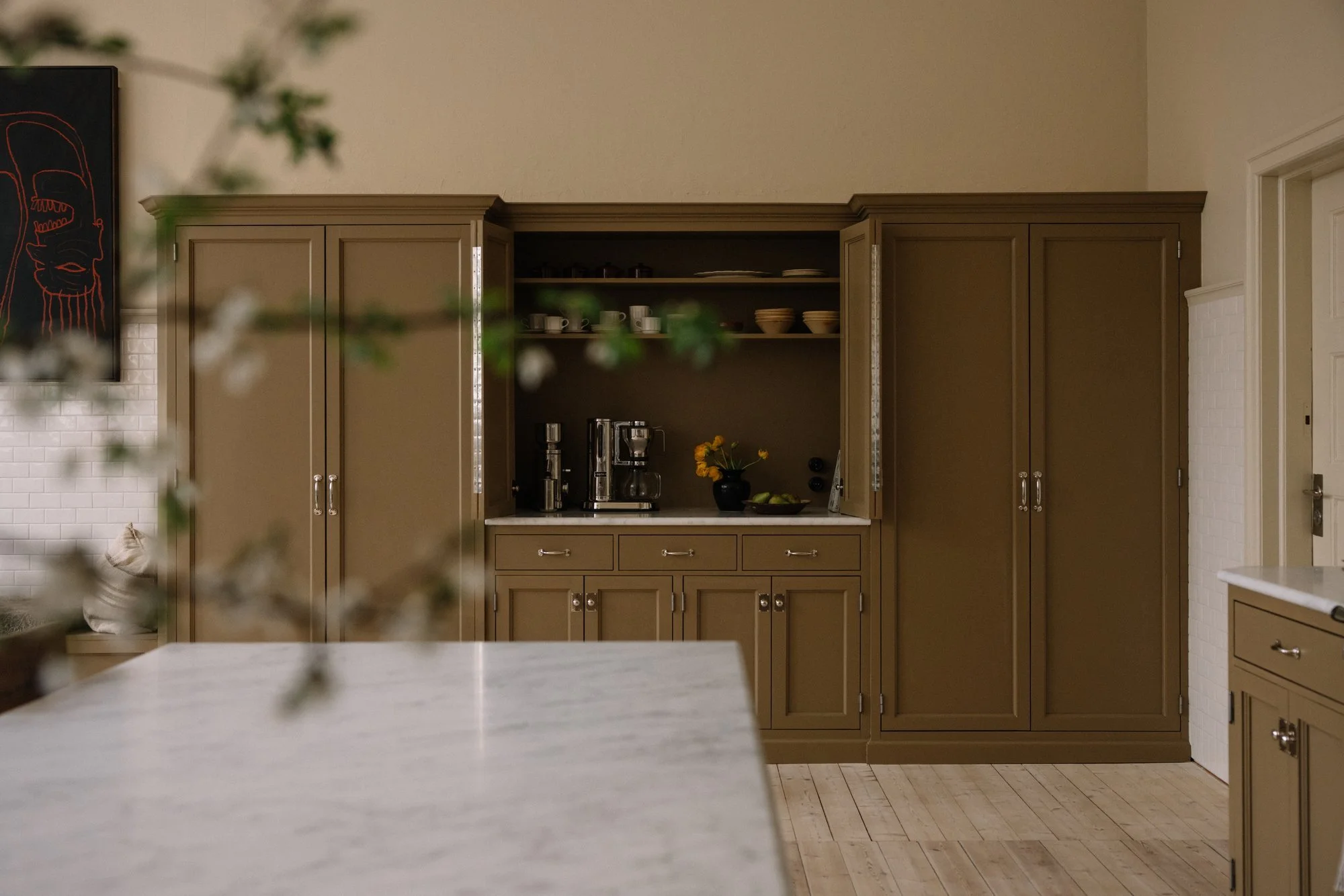
Kitchen color combinations
Many of you have asked about the color codes we used in the kitchen in the 1927 School House, so I thought I'd share them here, along with a bit of the story behind the choices.
I love designing kitchens, it’s a fun challenge: making a space beautiful, social and thoroughly practical. For this kitchen I wanted the design to honor the building’s 1927 architecture while also feeling current. The colour combination I chose is my way of letting past and present meet.
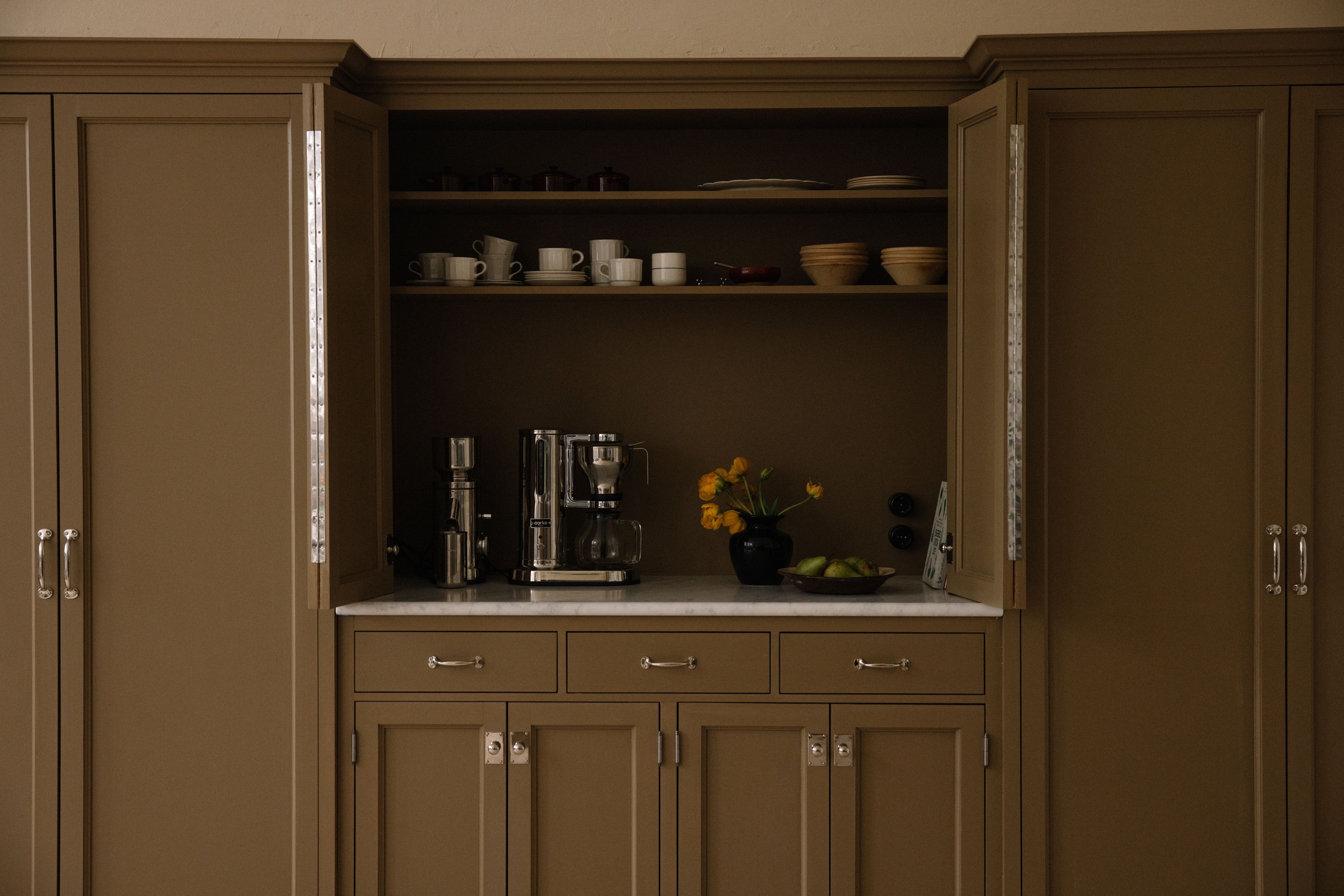
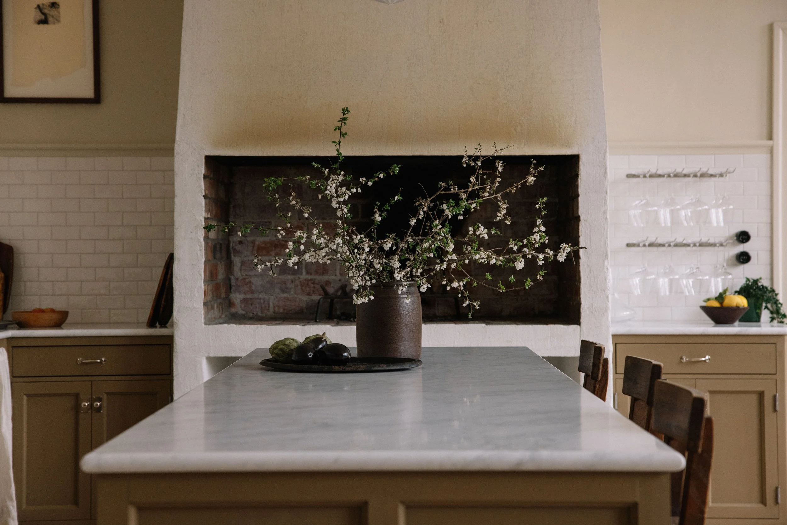
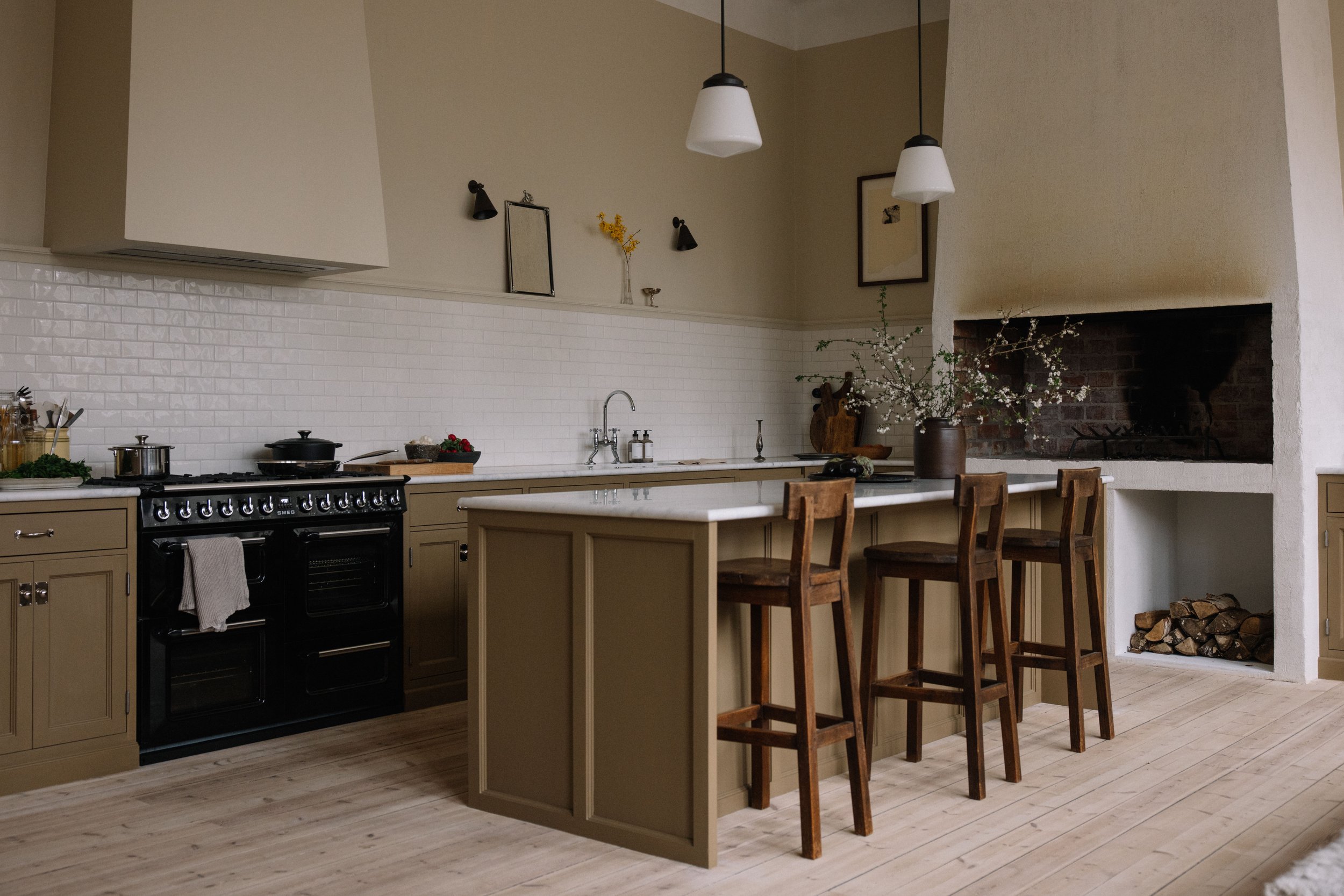
For the cabinetry I used 1864 Anonymous by Jotun (NCS S4020-Y10R). I’d been wanting to use this complex shade for a long time. It carries yellow and brown undertones with subtle hints of green and ochre. In sunlight it glows almost golden; in shadow it deepens to an elegant, earthy brown. I love the way it changes with the light and how it contrasts with the stone countertop.
We painted with linseed oil paint instead of standard modern paint, which performs very differently. It was Noah’s first time working with linseed oil; after many layers, hard work and perseverance, we achieved a beautifully deep tone and rich surface texture.
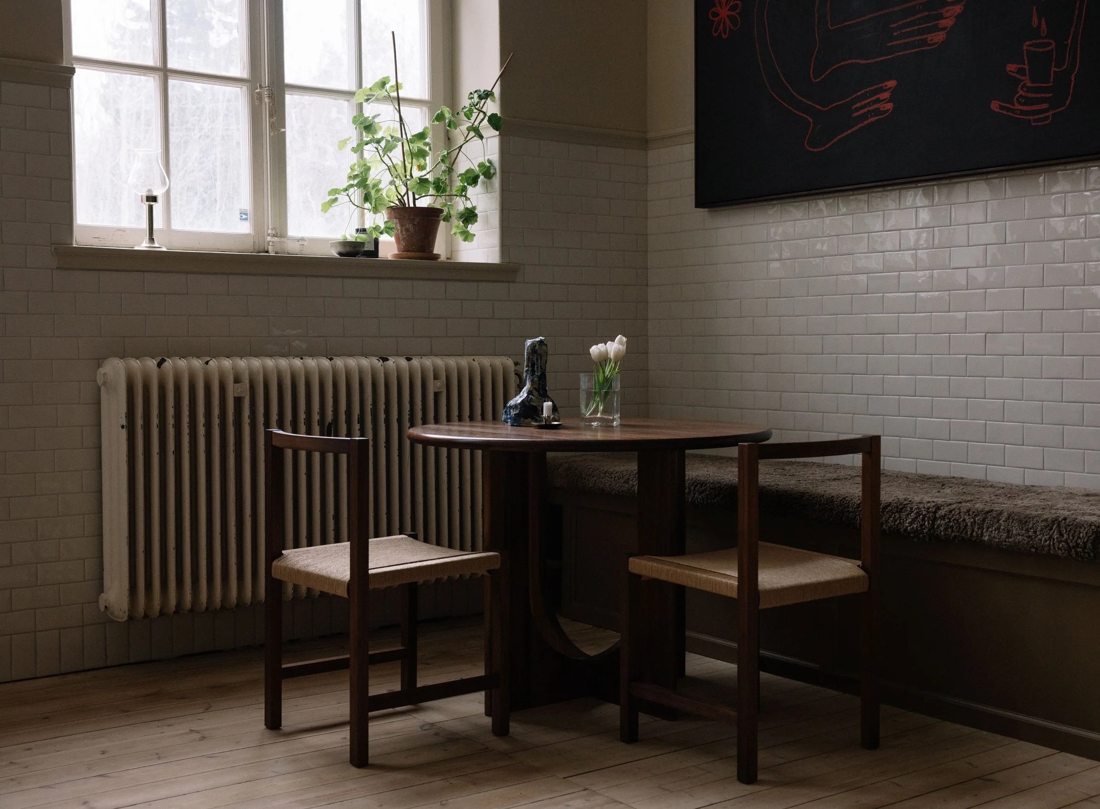
The walls are painted in 1276 Soft by Jotun (NCS code 1507-Y16R). I chose a warm hue to balance the tile throughout the room. It was a great alternative to white because of its neutral tone, and it allowed the room’s centerpiece, the fireplace, to really have its moment. So while the cabinetry is rooted in history, the wall color gives the space a modern feel, and that contrast is exactly how I love to work.